Redesigning Self-Service Portal UX
The Digital Transformation initiative was launched, resulting in highly satisfied customers in November, 2023.
My Role
Product Designer
Timeline
Q1 2022

From painful order journey to satisfied customer
Order journey time from 42 mins
Create offer time reduced from 1 day
Agent training time reduced from 32 hours
2 mins
10 mins
2 hours
Goal and Objective
The goal was to transform the digital experience for customers of Puerto Rico's leading telecommunications service provider. By aligning the platform with business objectives and leveraging out-of-the-box capabilities, we aimed to empower customers to seamlessly manage plans and payments.
Business Challenges
Analyse and enhance existing “change plan” journey for self-service Telco portal.
Consolidate decentralised services into a unified platform to ensure seamless access, consistency, and efficiency across all touch points.
Need for tablet-responsive design to enhance in-store service, enabling seamless transactions and efficient interactions for both staff and customers.
Business Need Analysis
The activity helped us align the goal, understand the pain points and insights through valuable inputs on user needs, priorities and potential features for the portal. It also facilitated collaboration among the teams ensuring a shared vision for the redesign.

Focused group Discussion Insights
By creating personas, the team could empathize with the users, making the design process more user-centered.
It helped stakeholders understand the context of user behaviors and prioritize features that mattered most to them.
During design reviews, personas were used to test discuss the design direction and make decisions.

Persona
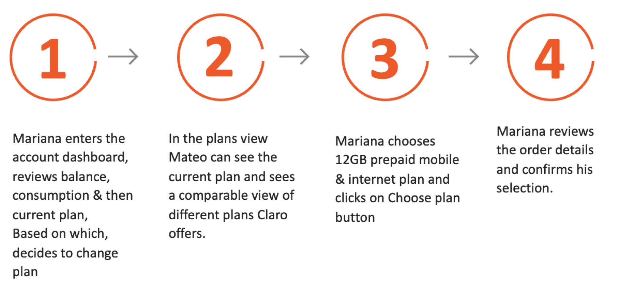
Change Flow
During stakeholder interview and expert review analysis we got to know that the
User is unable to easily find the option to change or replace plan upfront
In the replace flow initiation the suggested plans made no sense to the user, it was difficult to make a choice and decide
The availability check for sufficient balance was unclear
Research Insights
Easy split view between current plan and suggested plans
Clear suggestion from system that make decision easier
Plans details and selection clarity
The suggested plans list view is easy to compare and select a plan
The comparable view kept when scrolling to additional plan.
Ability to promote specific plans by definitions.
Ability to view the full plan details.

Compare and select plan View
User review before submission
Clear information about the available balance to keep user informed
Support section for user support before placing the order
Total deduction details for user trust
Provision to change the plan at this point
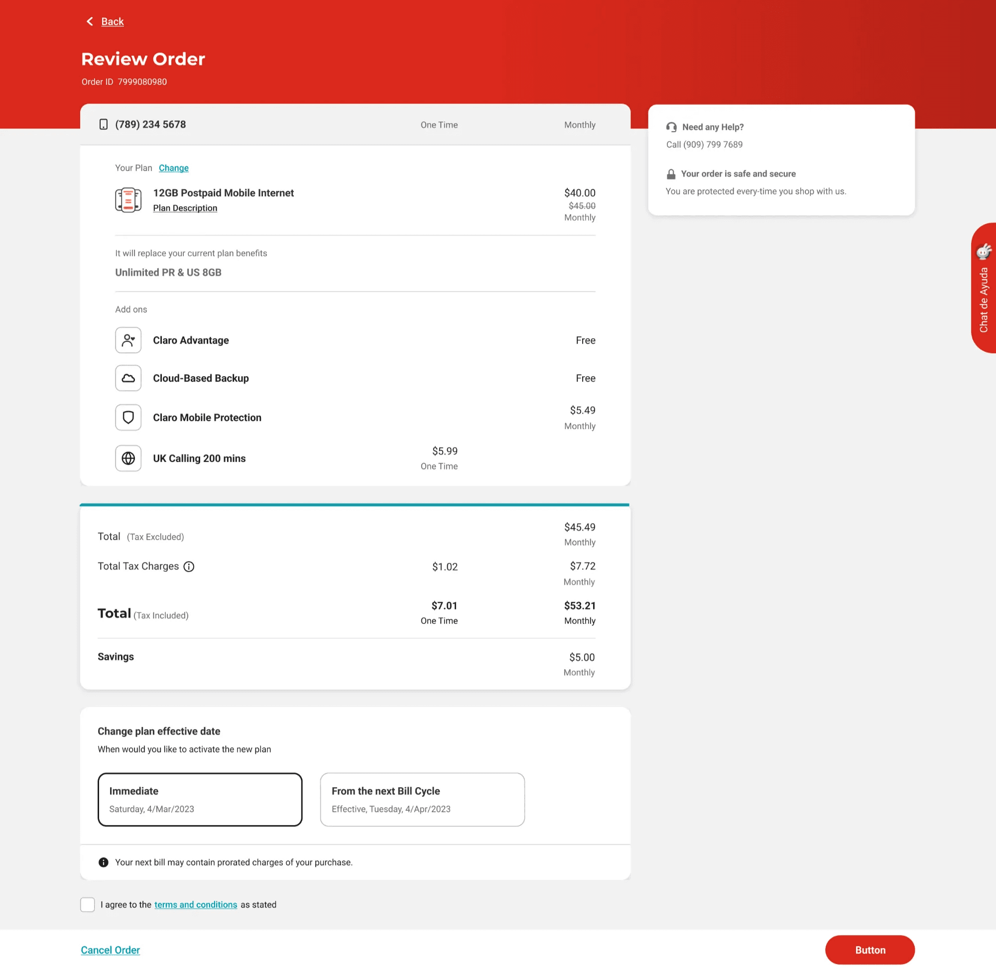
Review order
Total Number of participants | 7
Age range of participants | 22-32
Gender of participants | Female, Male
Income of participants | $19,999 - $124,999
Countries of participants | Australia, Germany, India, Netherlands, Spain, U.K, U.S
Overall, the flow was completed successfully with no issues at all. Most of the participants stated that the flow is easy and straightforward.
“The overview screen surprisingly shows everything you should need to know.”
“It was very easy because it just says my plan and it says what my current plan is without clicking on anything.”
“The plan list screen is very easy to understand because it shows the current plan, versus the suggested plans in an easy way to compare.”
“The checkout process is built from minimal steps, and very easy to understand.”
“The overall flow is clear. The changing of the plan was very, very easy and very intuitive"
User Testing
Participants
Feedback
Presenting key information upfront with easy to scan layout
Highlights on balance, top up, allowances, customer product inventory with relevant actions available
Quick actions for additional activities
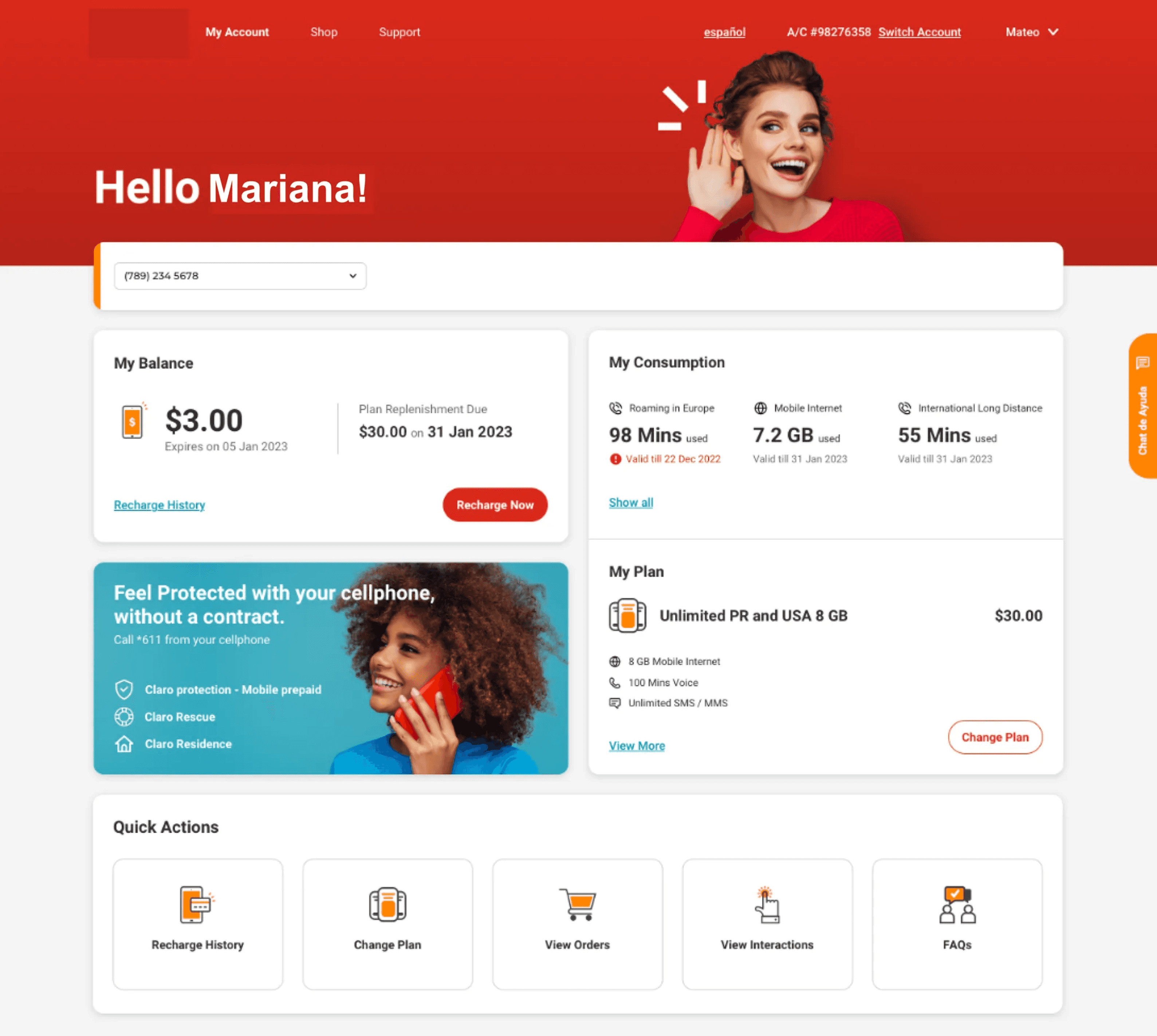
Account Dashboard - Solution highlights
Design Solution
Detail Design

This process helped evaluate and document the current user experience. It provided valuable insights into user challenges, which were later validated during stakeholder interviews.
UX Observations

Balance & consumption report prioritized by expiration date.
Consumption full view grouped by buckets types
Account Dashboard - Solution Highlights

Simple entry point for primary action like Change Plan or recharge
View current plan details and benefits
Account Dashboard - Solution Highlights

Delivering through progressive agile methodology, ensuring collaboration and support with all cross functional teams
Success Checklist


Want to connect?
I’m currently looking for new opportunities in lead design roles. If you’re in Pune I’d love to grab a cup of coffee, or we can jump on a call any time.
content © 2025 Neelam Dhanani
email me
see my resume


Next case study >
Back to top
Want to connect?
I’m currently looking for new opportunities in lead design roles. If you’re in Pune I’d love to grab a cup of coffee, or we can jump on a call any time.
content © 2025 Neelam Dhanani
email me
see my resume
Next case study >
Back to top